The UX Train: Getting Your Clients on Board
4 MIN READ
10/19/2015 | Human-Centered Design

You’re on the fast track to building a successful product after having discovered the value of a user-centered approach, but your clients aren’t all on board yet. Project goals, deadlines, and politics are outweighing the needs of the user.
As advocates for your users, you must persuade your clients and stakeholders to put the users first. Don’t know how? Here are three tips to help you out.
1. Use the client’s goals to your advantage
The first thing to understand before beginning any project are the goals of the client.
What problem are you trying to solve?
- What does success look like? (e.g., Is it an increase in sales or customer satisfaction? Or, is it a decrease in time spent on task?)
- The answers to these question will provide the team with clear goals and will help clients gain some understanding on what it takes to achieve them. Often, user experience will go hand-in-hand with the goals set for the project and the company.
2. Build good faith by including stakeholders
Putting forth UX recommendations can feel like a negotiation at times, and like any negotiation, building good faith can be advantageous when it comes down to decision making.
Traditionally, stakeholders are only involved at deliverable checkpoints or when the problem is first being defined. Inviting stakeholders to participate in other stages of development can help improve their understanding of user-centered design and give them a sense of ownership in the final product.
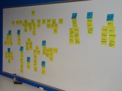
Consider including stakeholders in card sorting, which highlights the importance of studying user expectations and understanding of content during product creation. By performing the activity and watching others do it, they will gain a better understanding of the relevance of user experience in all stages of product development.

Go one step further and invite stakeholders to brainstorms or design studios. (Remember: it’s critical to apply the same criteria to their ideas as anyone else’s to maintain the integrity of the design — even if it means not using any of their ideas.)
Building good faith with your stakeholders will inevitably ease “negotiations,” during which you’ll see eye-to-eye on the value of a user-centered design process when considering the rest of your project.
3. Provide alternatives
The first two tips provide ways to get your clients on board with a user-centered design process and the activities that they entail. This third tip is critical and involves handling a client’s preference that collides with your design.
The easy (and usually wrong) solution to this problem is simply accepting the client’s preference (especially if it’s a hard-line stance) and adjusting your design around it. That, sorry to say, wouldn’t be solving the problem. In the same way that we dig deep into our users’ stories or feedback as UX designers and researchers, the same rigor should be applied to client preferences.
For example, imagine that a client wants to use an image carousel (a slideshow) to promote content on their website. After assessing the content, users needs, business goals, and UX best practices, you determine that an image carousel may not be useful and could actually take away from the goals of the website; carousels can take up valuable real estate and conceal important content that viewers could opt out of viewing. From the client’s standpoint, however, a carousel would bring some visual appeal to the site.
You try leveraging the client’s goals and the good faith gained earlier. You explain the negative impact that an image carousel could have on user experience. But your client just prefers carousels. What then?
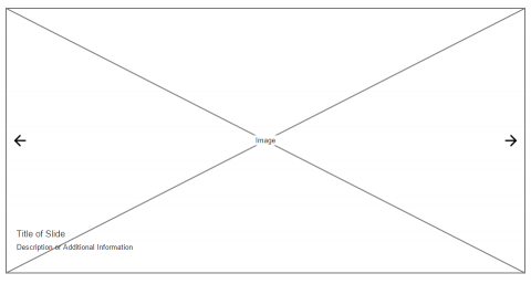
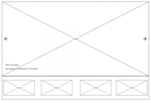
How about alternatives? A carousel can be constructed in various ways, including the three that we’ve provided here as examples:
Example 1:

Example 2:

Example 3:

Example 3 brings out the content so that the user can see everything on the page. It doesn’t take up as much real estate, nor does it hide information like Example 1 (a traditional slideshow). It also doesn’t use thumbnails like
Example 2, which can present a usability problem for users who can’t quite make out the image and intent.
In essence, Example 3 addresses certain usability concerns attached to image carousels while pleasing the client who desires the added visual appeal. Of course, some convincing may still be necessary, but providing an alternative like this will serve you better than coming to the table with no carousel at all (or crumbling to a client’s idea that may end up backfiring).
Keep these tips in mind as you navigate through your next conversation, planning meeting, and negotiation with your stakeholders. Advocate for your users! The true success of your project depends on them.
What are your tips for negotiating with clients who strain to see the importance of UX? Tweet us @MetroStarSystem
.png?width=150&name=Jason%20Stoner-square%20(2).png)
Written By:
Jason Stoner
Sr. Director of Transformation
you might like these too
Accelerating UI Development with MetroStar's Comet and AI
AI/ML | Human-Centered Design | Innovation Lab
Delivering Real-Time Insights for Faster DoD Mission Planning
MetroStar Culture | Human-Centered Design | Innovation Lab
Five 2024 GovCon Tech Trends: Perspectives from Six Industry Experts
Enterprise IT | Feature | Cyber | AI/ML | Human-Centered Design
want to stay in the loop?
Never miss a thing by signing up for our newsletter. We periodically send out important news, blogs, and other announcements. Don’t worry, we promise not to spam you.
